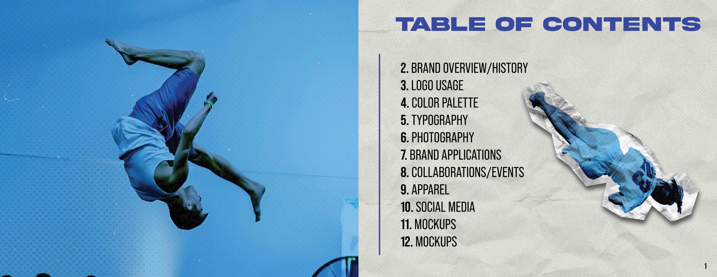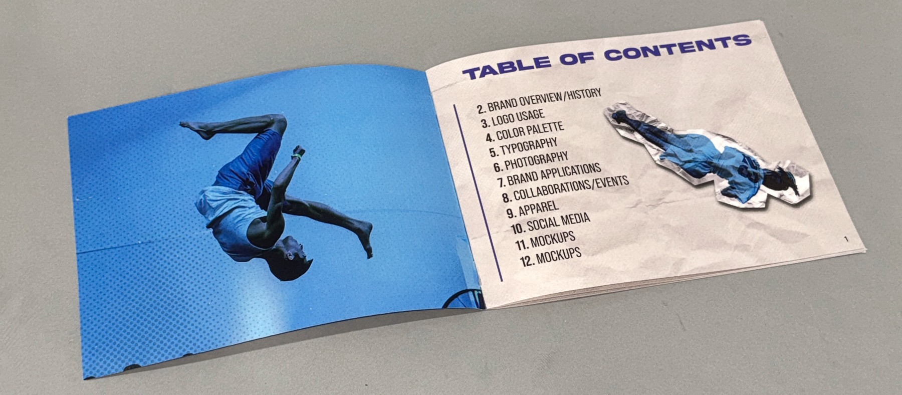
The printed Loopkicks style guide open at its contents spread, a tricker mid-flip filling the left page.

Printed, saddle-stitched01 / The object
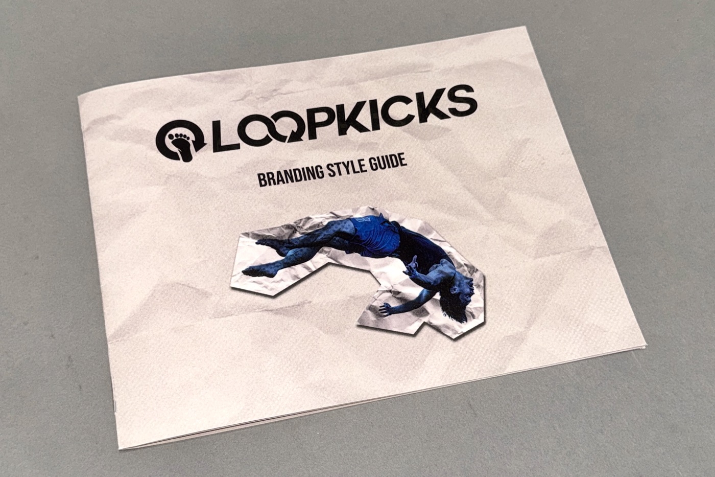
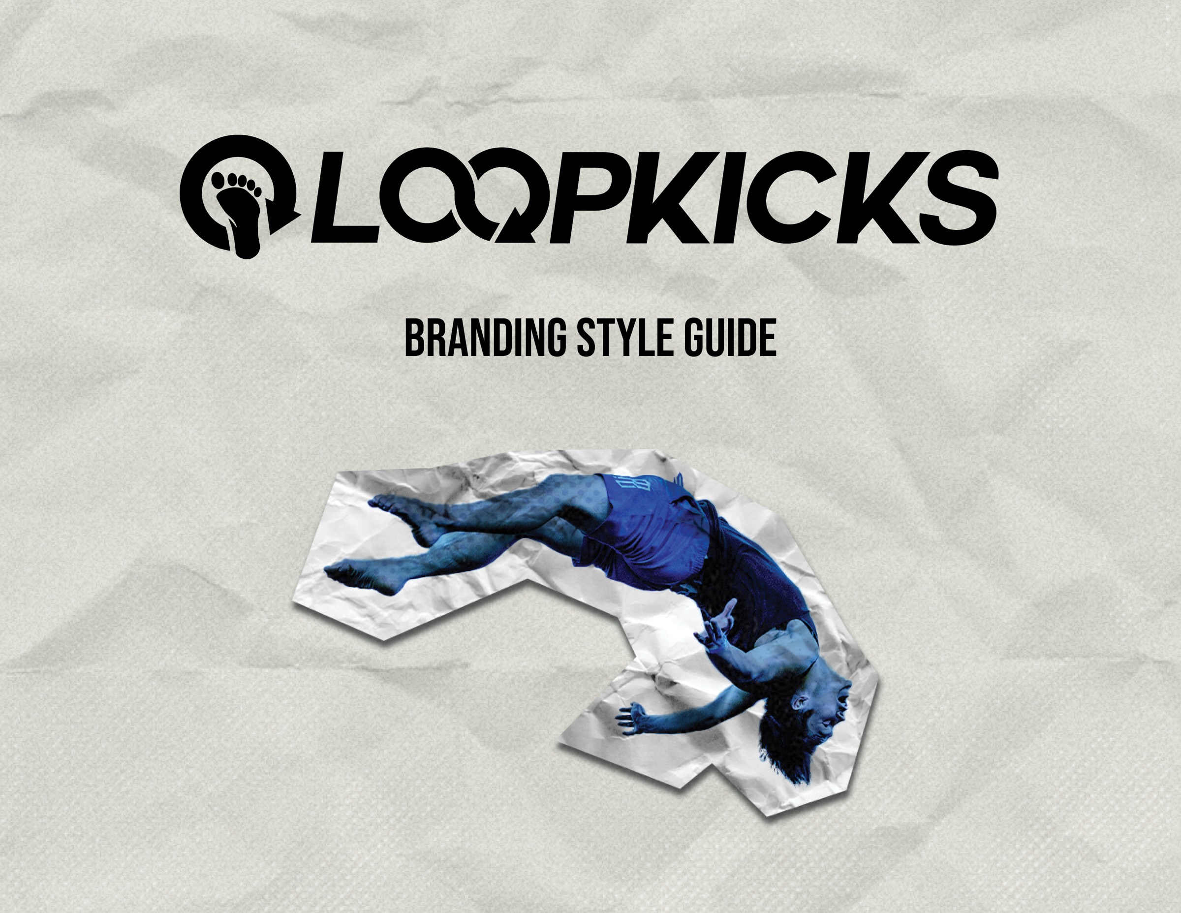
Front cover: the Loopkicks wordmark above a cut-out tricker on crumpled paper.
Cover
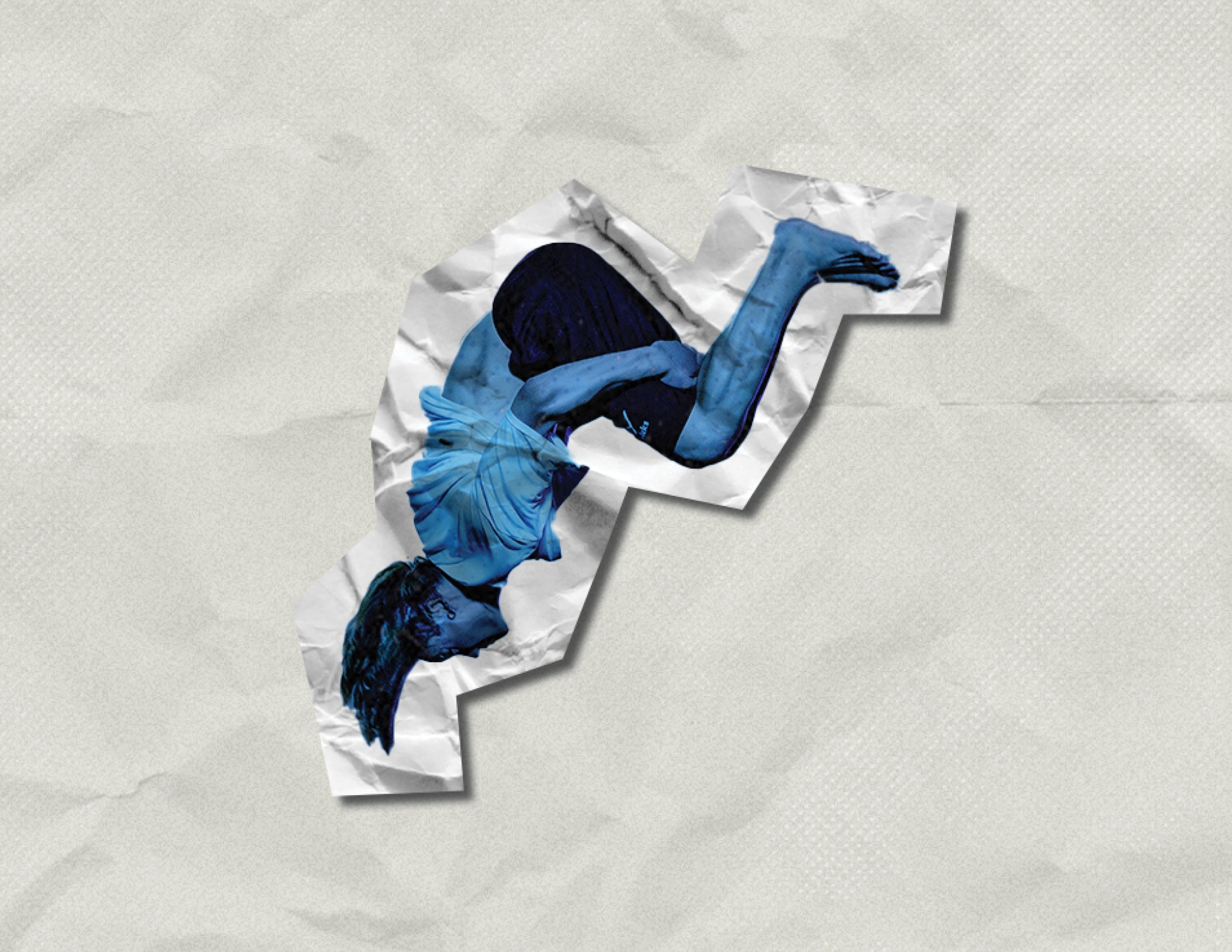
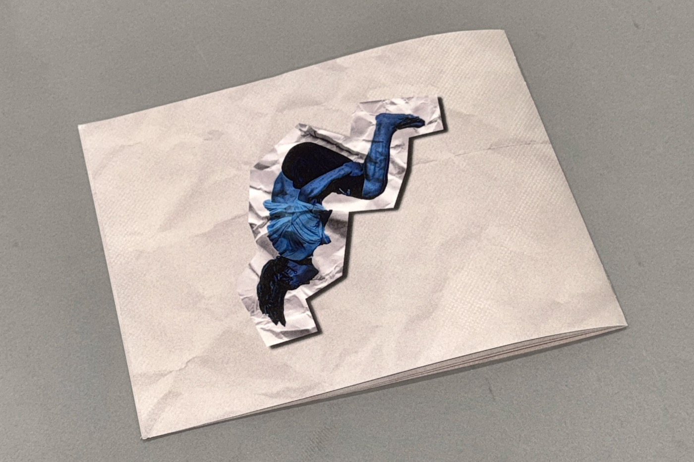
Back cover, carrying the cut-out figure alone.
Back
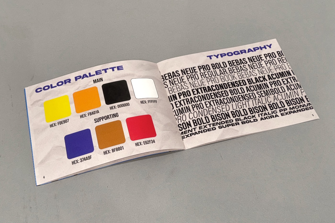
The colour palette and typography spread, open flat.
Colour & type
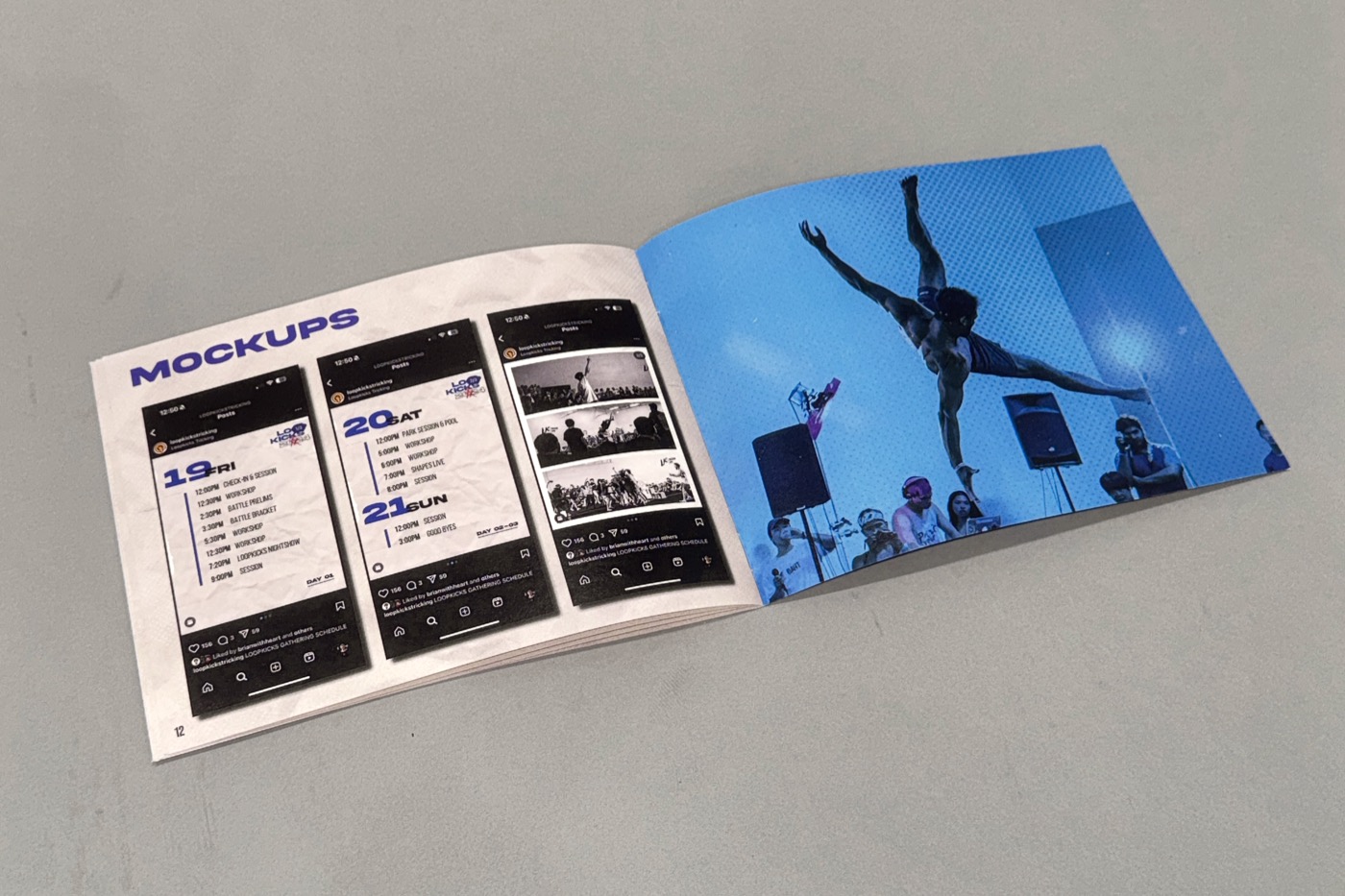
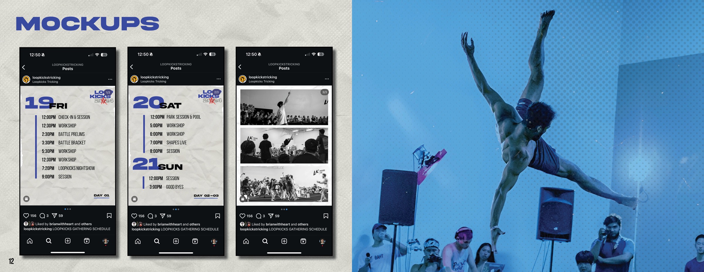
The mockups spread, phone screens beside a full-bleed photograph.
Applications

Read the guide02 / Sixteen pages

Cover artwork.
Opening photograph and table of contents.
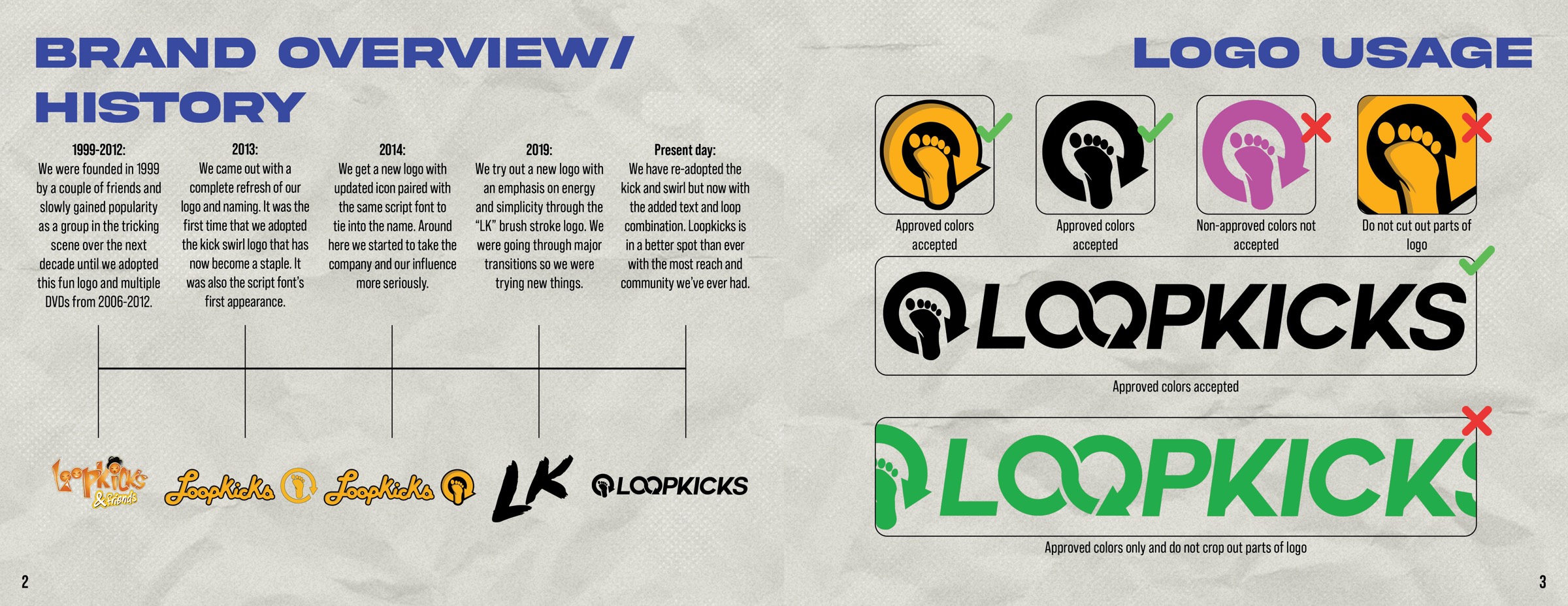
Brand overview and history timeline, facing logo usage rules.
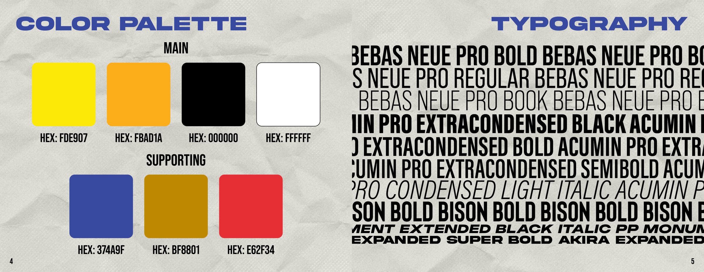
Colour palette with hex values, facing the typography specimen.
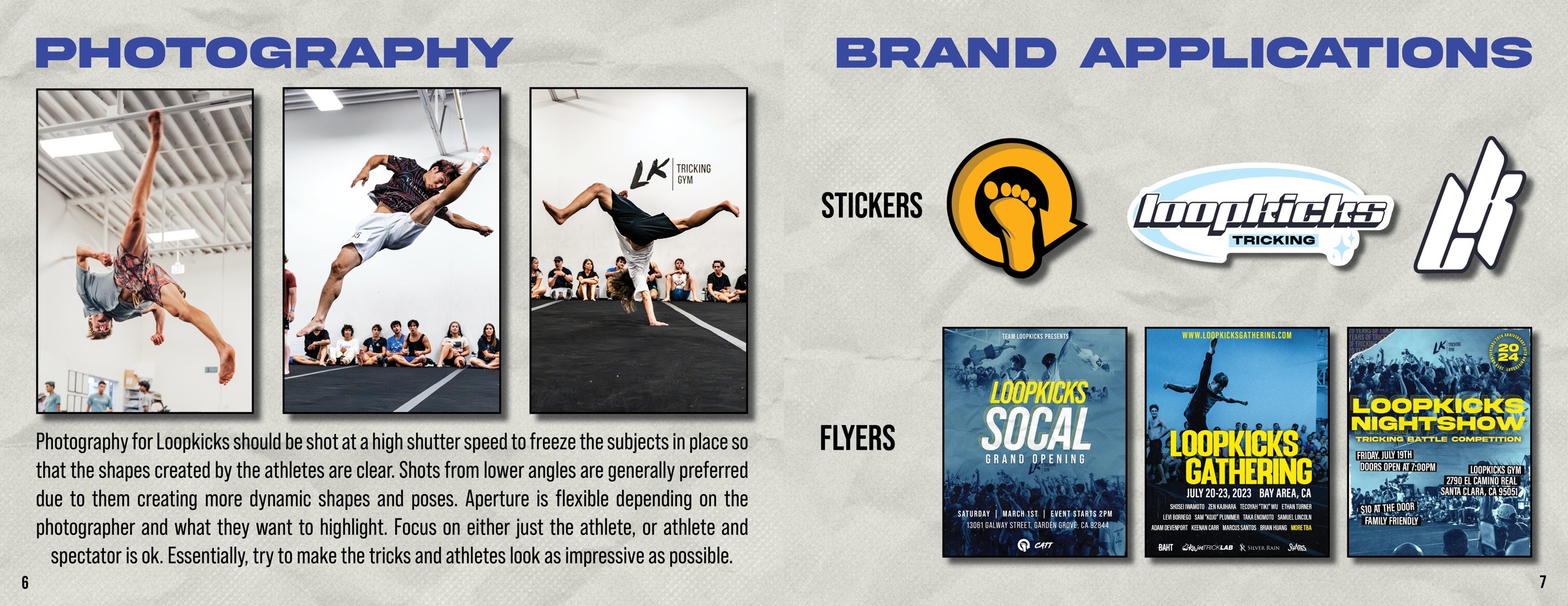
Photography direction facing brand applications — stickers and flyers.
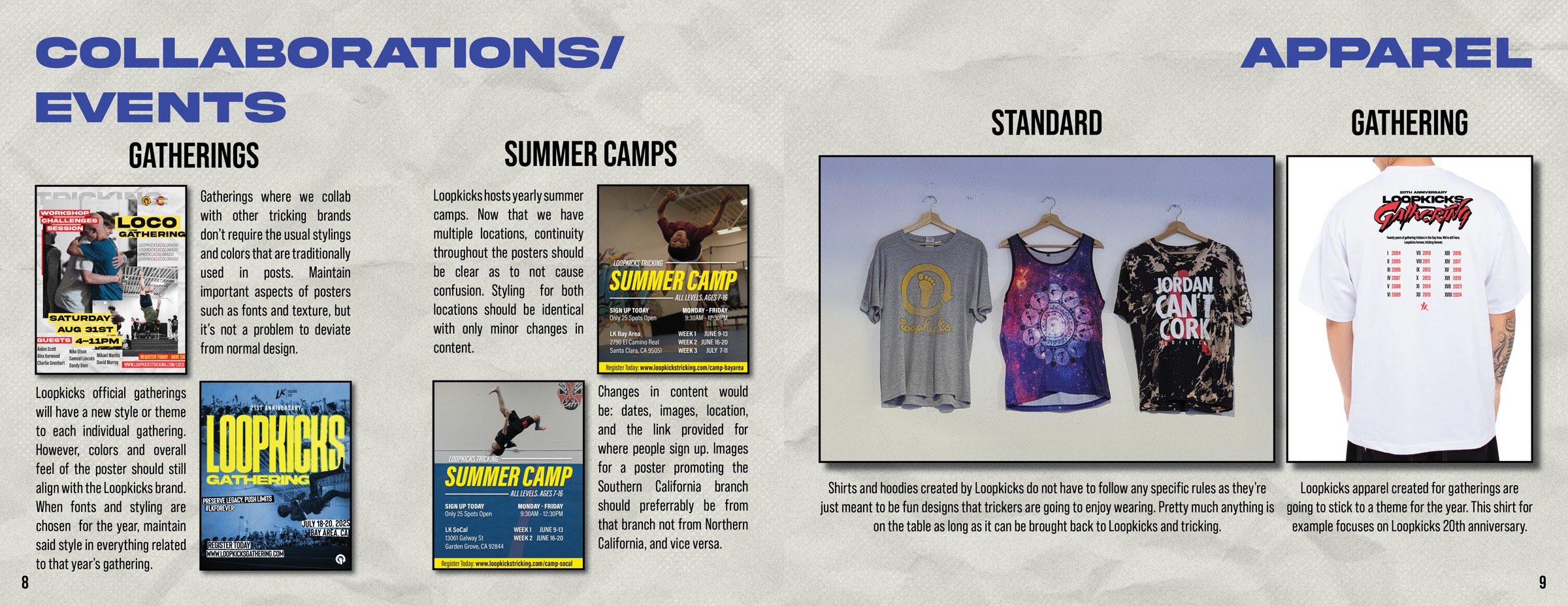
Collaborations and events facing the apparel range.
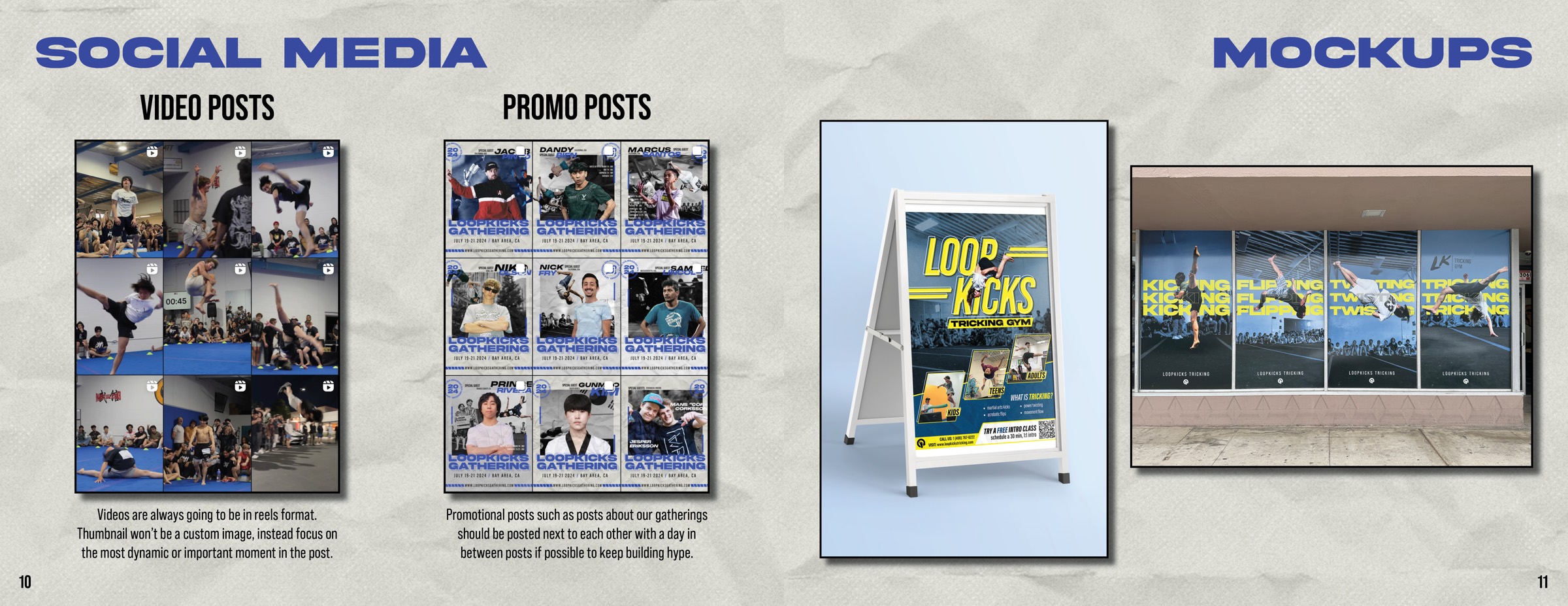
Social media guidance facing printed mockups.
App mockups facing a full-bleed photograph of a tricker mid-air.
Back cover artwork.

03 / The problem

A style guide has to hold a system still enough that others can follow it. Tricking is all movement, so holding it still was the risk.

The rules are strict, but the surface is torn and photographic and the athletes break out of their frames. I wanted the power of the sport to survive the page.

Structure, without standing still.

Saddle-stitched booklet · 11 × 8.5in landscape · Digitally printed · Uncoated stock

The Art of Performance Next project →